
How to Prepare Images for the Web - Boost Speed, SEO, and User Experience

Modern websites rely on visuals to tell stories, sell products, and build trust. But images are also the number one reason pages load slowly — and speed directly affects both user satisfaction and SEO rankings. If your website feels sluggish, oversized or unoptimized images are often to blame.
This guide explains how to prepare images for the web, why responsive and optimized images matter, and how tools like WebReady.dev make the process effortless.
Why Optimizing Images Matters
When a visitor lands on your website, your images are among the first files to load. Each uncompressed, oversized image adds seconds to your page speed — and that has measurable consequences:
- Every second of delay can drop conversions by up to 7%.
- Google ranks faster sites higher because page speed impacts SEO.
- Mobile visitors on slower connections may leave before the page even loads.
Optimizing images isn’t just a technical task; it’s a marketing and user experience decision. It determines how quickly users engage with your content, how search engines evaluate your site, and how professional your brand feels overall.
The Basics of Web Image Optimization
Image optimization is the process of preparing your visuals for efficient web delivery — maintaining quality while minimizing file size. Here are the core techniques involved:
1. Use Next-Gen Image Formats
Traditional formats like JPEG and PNG are slowly being replaced by WebP and AVIF. These newer formats provide the same visual quality at 30–70% smaller file sizes, resulting in significantly faster load times.
2. Resize to Fit Real Display Needs
Uploading a 4000px-wide image when your website only displays it at 1200px wastes bandwidth. Create smaller, properly sized versions that match your layout and target device resolutions.
3. Compress Intelligently
Lossless compression keeps image quality intact, while lossy compression slightly reduces visual fidelity for dramatically smaller sizes. The goal is to balance appearance and performance — often 70–85% quality is ideal.
4. Implement Caching and Lazy Loading
Allow browsers to store images locally (via caching) and use lazy loading so off-screen images load only when users scroll to them. This improves perceived speed and lowers data usage.
Understanding Responsive Images
Responsive images automatically adjust based on screen size and resolution. Instead of loading a single large file for every user, responsive design uses multiple versions optimized for different devices.
In HTML, this is done with the <picture> tag and srcset attributes:
<picture>
<source media="(max-width: 600px)" srcset="image-600.webp" type="image/webp">
<source media="(max-width: 1200px)" srcset="image-1200.webp" type="image/webp">
<img src="image-2000.webp" alt="Optimized sample image" loading="lazy" width="2000" height="1333">
</picture>
This tells the browser:
- Serve a smaller file on phones.
- Serve a medium file on tablets.
- Serve a larger file on desktops.
The result: better performance, reduced mobile data usage, and improved SEO through enhanced Core Web Vitals.
SEO Benefits of Image Optimization
Google’s algorithms prioritize fast, mobile-friendly websites. Optimized images directly improve key ranking metrics:
- Largest Contentful Paint (LCP): Reduced load time improves page experience scores.
- Cumulative Layout Shift (CLS): Proper sizing prevents visual shifts that hurt usability.
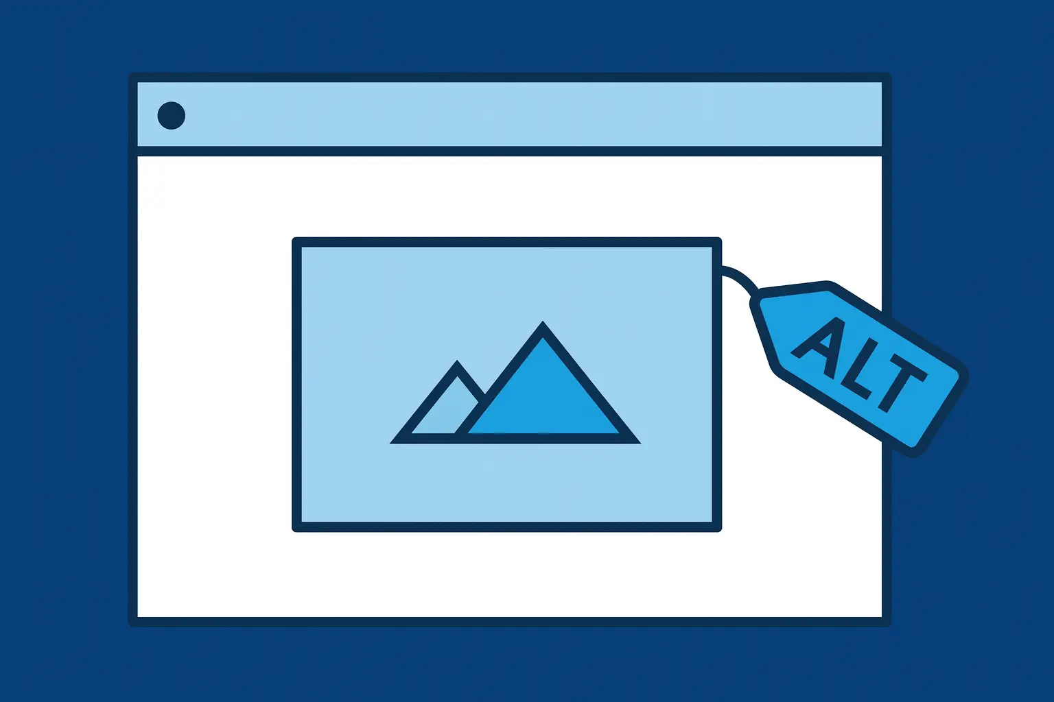
- Accessibility & Alt Tags: Search engines index descriptive alt text, improving keyword visibility.
- Image Search Traffic: Compressed and properly tagged images rank higher in Google Images.
A fast-loading website not only attracts visitors — it keeps them engaged longer, boosting overall search visibility.
Common Mistakes to Avoid
Even professional developers make mistakes when handling images. Here are the most common ones:
- Uploading full-resolution photos directly from a camera or phone.
- Using PNG for photos instead of WebP or JPEG.
- Forgetting to include width and height attributes (causes layout shifts).
- Not creating smaller versions for mobile.
- Skipping compression altogether.
Each of these mistakes can double or triple load times — and that can quietly sabotage SEO performance.
Introducing WebReady.dev — The Easiest Way to Optimize Images
WebReady.dev is a free online tool that automates everything above — instantly.
You upload a single image, and WebReady:
- Generates optimized WebP (and optional AVIF) versions automatically
- Creates three common breakpoints for responsive design
- Delivers a ready-to-use HTML snippet
- Requires no Photoshop or manual resizing
In other words, it turns an hour-long task into seconds — ideal for web developers, designers, and small business owners alike.
Whether you’re updating a portfolio, launching a local service website, or building an e-commerce platform, WebReady ensures every image looks sharp and loads fast across devices.
Final Thoughts
Optimizing images is one of the simplest ways to improve SEO, speed, and user experience — yet it’s often overlooked. With next-gen formats, responsive techniques, and automated tools like WebReady.dev, you can ensure your website performs at its best without any guesswork.
Take five minutes to test a few of your current website images through WebReady. The difference in speed and clarity will speak for itself — and your users (and search rankings) will thank you.
Ready to optimize your website’s performance?
Visit WebReady.dev and transform how you prepare and deliver images online — automatically, intelligently, and for free.